
Team
Xinyin Zhang (Team Leader, Programmer)
Joelle Lui (Map Designer)
Kayleigh Lewis (Art Designer)
Theo Dunn (Storyteller)
Mingyu Chen (Invited Actress)
Responsibility
Ideation
User profile
Wireframe + Prototype
Iteration
Tool
Figma
Adobe XD
Canvas
💠 Motivation
CuGO was a collaborative proposal which won the first prize in Create-Athon held by the Faculty of Media Production and Design (MPAD) at Carleton University.
Design prompt: How to help students acclimatize to on-campus student culture?
Since our group members varied from years and cultural backgrounds, we had all kinds of frustrations and concerns. We hoped to start from ourselves to design an app which could solve our problems, then further every student’s.
💠 Final Result
Full user flow:
💠 Research
#1 Interview + Problem
Our group members’ backgrounds varied in nationality, school year, and gender, so we played roles in “user zero” and interviewed each other’s struggles and difficulties after entering university.
#2 Target User
As designing for Carleton students, this mobile app is targeting students from all years, genders, and backgrounds. This app is not only a tool to request resources but also a friend to accompany students.
#4 Tasks
AI robot responding to users’ request.
Way-finding in both 2D and Augmented Reality.
A social quad for building students’ own networks and requesting peer-help.
Community section including MBTI Test, Club, Q&A, and Event
#3 Scope
Implement an interactive mobile platform tailored to aid students with finding resources, community, and navigating on campus and virtual student experiences.
💠 Design Process
#1 Ideation
#2 Wireframes
Low-Fidelity Wireframe
High-Fidelity Wireframe

#3 Iterations
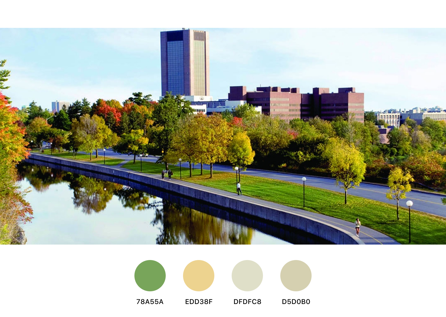
Innovated the colour theme from Carleton’s traditional black and red to autumn shades.
Sign in/ Log in page added to divide user flow.
New users create accounts through clicking sign in button
Regular users can log in directly
Content layout changed to vertical alignment so users can simply scan information in one direction.
Reorganized map elements and added a 2D map option as an alternative of AR map.
Displayed building and facility selection boxes before entering navigation mode
Listed elements alphabetically for quicker navigation
Redesigned Q&A section in a more clear layout.
Top bar showing page theme to help users track their actions
Search bar and more filters added to classify questions in detail
Showing other students’ replies to questions to increase interactions
💠 Future Development
Conduct a larger-scaled interview.
Invite more students to test the prototype.
Collaborate with the school to realize this app.