Facilitate residents’ access to Ottawa neighbourhood Covid-19 data.
Team
Xinyin Zhang (Team Leader, Programmer)
Jiaziruo Sun (UX Developer)
Shuheng Wang (UI Designer, Storyteller)
Xiaoman Lin (Programmer, Information Manager)
Yuchen Hu (Art Designer, Programmer)
Responsibility
Manage team work flow and tasks.
Conduct user interview and summarize needs and goals.
Function ideation + early sketches.
Data exploration + cleaning +visualization.
Conduct user test.
Tool
Google My Maps
Tableau
Vegalite
Datawrapper
💠 Motivation
As the pandemic spread, Covid testing and vaccine has become a public concern. However, Covid data was usually spread in all kinds of websites. It’s hard for us to request needed information within one web page.
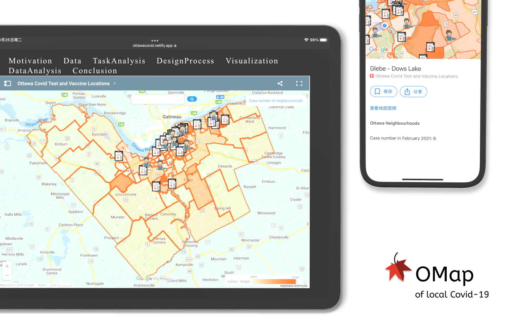
Our group planned to create an interactive map with Google My Map and Tableau to quickly inform users of up-to-date Covid cases in Ottawa neighbourhoods and locate clinics where Covid tests and vaccines were available.
💠 Final Result
Filter Children Service, Non-symptom Covid Test, and Walk-in Available data from the big pool.
Click on wards to see each neighbourhood’s case number and interact with icons to view more information of the centre (location, opening hour, parking availability…)
Links and Google Maps navigation icon in the info boxes will lead users to external pages for further information.
A button showing case ranking in neighbourhoods, can be sorted by alphabetic order or increasing/decreasing amount.
💠 Research
#1 User Interview
We have interviewed 10 Ottawa residents about their concerns and problems with Covid tests and vaccines during the pandemic lockdown. Interviewees varied in age, gender, and job.
#2 Define the Problem
Covid cases were not updated quickly.
Time-consuming when jumping between multiple web pages to look for needed information
Covid related apps usually only have mono-function.
Hard to quickly find a centre which is parking, walk-in, or children service available.
Little knowledge of symptoms when doing self-tests.
#3 Persona
This project is serving all the Ottawa residents.
Considering that different groups will have specific needs, such as children service and parking availability, we try to cover ones which are the most requested but frequently missed by organizations.
#4 Visualization Research
The visualized data related to case accounts, vaccines, and testing, released by Ottawa Public Heath has inspired us to ideate our map, but we found there’s few joint information which provided residents with these data at one-time.
Key takeaway:
Interactive wards to display case accounts
Case ranking by wards
Key takeway:
Use colour range to show data
Create data layer for multiple options
Interactable design elements like pin locations

Key takeaway:
Filters of accommodation, age group, appointment, opening hours…
#5 Tasks
Based on our research and user interviews, we listed all the tasks we needed to accomplish with an importance ranking.
💠 Design Process
#1 Ideation
Initial sketches
Final blueprint
#2 Data Exploration
Before we started to build the graph, we looked into several Covid datasets and created visualizations to examine which dataset would be best option for our visualization.
We further looked into Ottawa neighbourhood Covid case data and vaccine eligibility. Finally, our group decided to use Covid test centre location, Ottawa neighbourhood Covid case, and vaccine location datasets as our reference data.
1️⃣ Testing Locations with Walk-In Option
This map shows which Covid-19 testing locations support the walk-in option. There are three dimensions encoded in the map which are neighbourhoods, walk-in Covid-19 testing locations, and Covid-19 testing locations by appointments.
2️⃣ Daily Cumulative Cases and Deaths in February, 2021
This graph combines two bar graphs, mainly using marks of lines and areas, and channels of position, colors, length and areas to visualize quantitative data of case and death accounts.
3️⃣ Weekly Number of People taking COVID-19 Test
This visualization combines a line graph and a bar chart to represent the weekly number of Ottawa residents tested for COVID-19 and the percentage of residents tested with laboratory-confirmed COVID-19.
#3 Iterations
We first created a draft prototype to visually illustrate each design element.
-
allow users to focus on a single dataset or have a greater look at the general situation.
-
differentiate data layers using distinct icons.
-
neighbourhoods coloured in gradient orange to show the level of confirmed case numbers.
-
give detailed information about each centre, including address, opening hours, and website links when clicking on pins or wards.
-
find users the route from their address to their destinations.
Then we remade a prototype with Google My Map and Tableau to realize all the design elements and a ranking button in addition.
#4 User Feedback
Easy and straightforward to use but clearly and effectively demonstrates all the data.
Could complete most of the tasks.
Suggested using distinct icon style for each kind of Covid test centre and making icons less cluttered when zooming out.
Information window contained repeating opening hours, unnecessary coordinates, and empty attributes.
Add hovering info bar on the plots and neighbourhoods and add brush-and-link between the map and the bar chart.
💠 Future
Keep tracking up-to-date data and update onto our map.
Optimize UI design of our website and visualization based on feedback.
Study more software to increase functionality.